HA Bewindvoering Website & Visual Identity
Webdesign
WordPress
Visual Content
Brand Identity
This project involved the design of a website and visual identity for a Dutch bewindvoerderskantoor — a court-appointed administration office supporting people with financial management and debt protection.
Most websites in this sector lean heavily toward calm, neutral, and reassuring visuals. While those qualities are important, the concept for this project intentionally took a different direction. The aim was to acknowledge the emotional reality behind financial stress, debt, and loss of control — situations that often trigger frustration, anger, and the urge to swear.
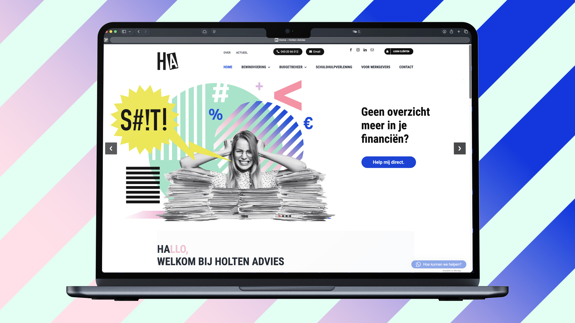
The visual identity uses the idea of bleeped or redacted curse words as a central metaphor. In audio and video, swearing is often censored with a “bleep” sound or symbols such as #@!%. Here, that same principle is translated into visual design. The imagery shows people in recognizable, high-stress situations — receiving an eviction notice or facing a stack of debt letters — moments where emotions run high and words are better left unspoken.
By censoring the swear words visually, the design creates space for humor, recognition, and relief, without becoming offensive. The result is a more human, slightly sassy, and empathetic approach that connects with the target audience on an emotional level, while still remaining clear, accessible, and professional.
This project demonstrates how concept-driven design can challenge conventions and create a stronger emotional connection — even within sensitive subject matter.


PROJECT DETAILS
| Year | 2023 |
| Client | Holten Advies |
| Skills | WordPress/Adobe Photoshop/Adobe Illustrator |
| Categories | Webdesign |
CREDITS
Design & Animation: 4Foot8 Studio